The Psychology of Colors in Branding & Design
Understanding Color Psychology
Color is more than a visual element—it’s a powerful communication tool that influences how people feel and act. In branding and design, every hue carries psychological meaning, making it essential to choose colors that reflect your brand’s personality, values, and audience expectations.
Key Benefits of Strategic Color Use
Using color intentionally can enhance your brand experience and influence customer behavior in meaningful ways.
Brand Recognition
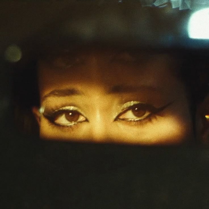
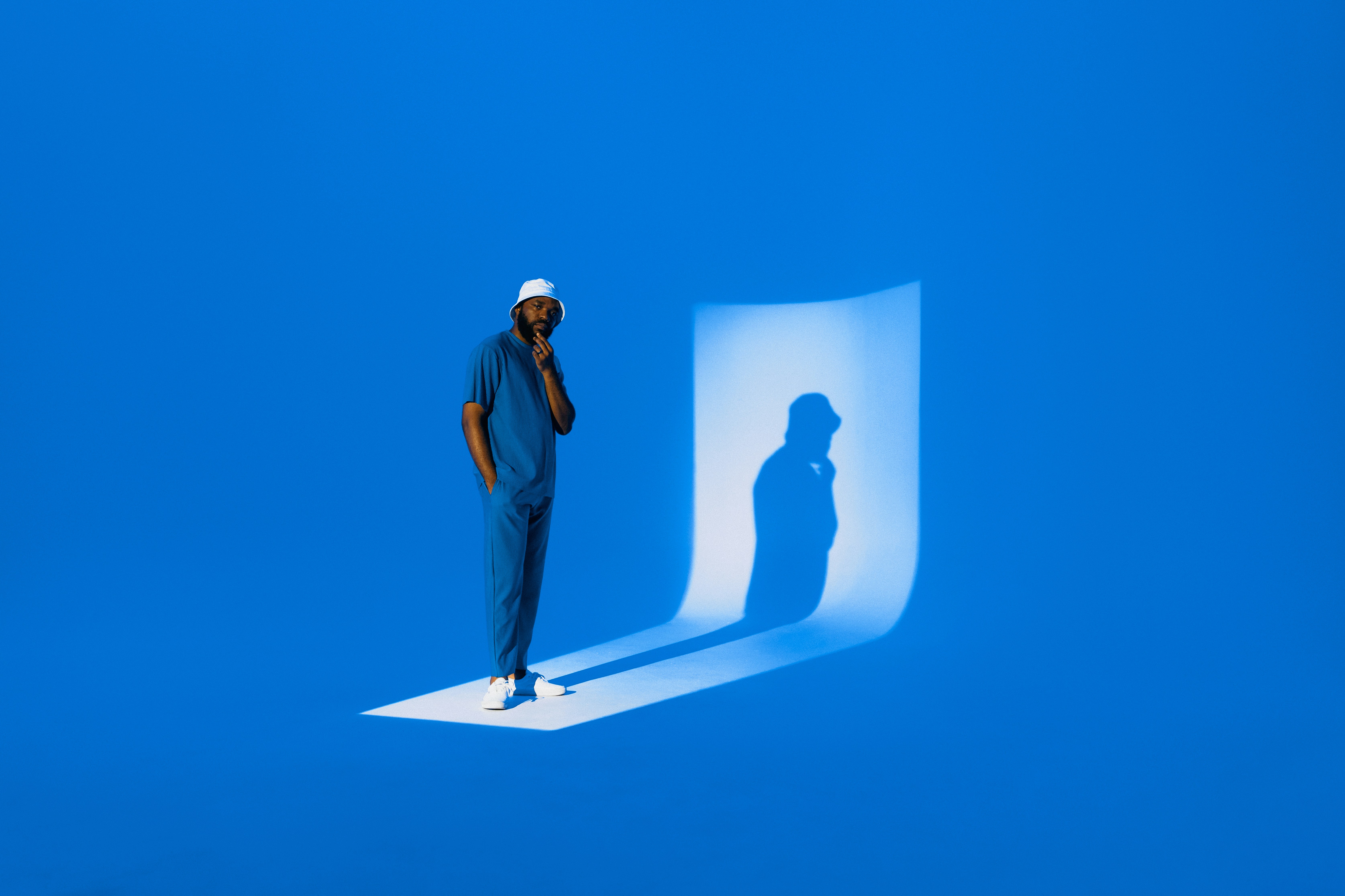
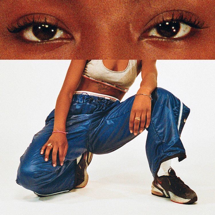
Color increases brand recognition by up to 80%. Think of how quickly you associate red with Coca-Cola or blue with Facebook. A consistent color palette builds familiarity and strengthens identity. In creative industries like fashion, color can be utilized within clothing and stylization even further. Leveraging contrasting colors or even monochrome palettes instantly creates a sharp visual identity that viewers sub-consciously associate with the brand and its clothing and vision.
Emotional Connection
Colors evoke emotional responses. Warm colors like red and orange stimulate excitement, while cool tones like blue and green evoke calmness or trust. The right combination connects with your audience on a deeper level.

Choosing the Right Colors for Your Brand
Each color carries its own meaning and psychological cues. Here’s a quick breakdown of common brand colors and what they typically represent:
Red
Emotions: Energy, passion, urgency, excitement
Widely used in: Sales, food brands, entertainment, youth-focused products
Example: Coca-Cola uses red to stimulate appetite and create excitement.
Blue
Emotions: Trust, reliability, calm, professionalism
Widely used in: Tech, finance, healthcare, corporate brands
Example: Facebook and PayPal use blue to convey trust and security.
Green
Emotions: Health, growth, nature, balance
Widely used in: Eco-friendly brands, wellness, agriculture, finance
Example: Whole Foods uses green to highlight its organic, health-first identity.
Yellow
Emotions: Optimism, happiness, creativity, warmth
Widely used in: Kids' products, creative agencies, hospitality
Example: McDonald’s uses yellow to evoke joy and grab attention.

Tips for Using Color Effectively
- Stay consistent: Use your primary brand colors across all platforms to build recognition.
- Consider your audience: Cultural and personal associations with color can vary.
- Use contrast wisely: Make CTAs and key content pop by pairing complementary colors.
- Simplicity often wins: A limited palette is easier to manage and keeps your brand visually cohesive. However, it is always subjective and often depends on the brand itself. Creative or artistic-driven brands or fields typically use bold and striking colors to evoke an edge and keep people on the edge of their seat.
Final Thoughts
Ultimately, color psychology is a foundational piece of visual branding. By choosing colors that align with your message and evoke the right emotions, you can create a stronger, more resonant brand identity. Whether you're launching a new product or refreshing your website, remember—color is never just decoration. It's communication.